 |
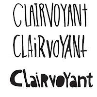
| Samples of my hand-drawn lettering |
I thought you had someone doing that for you, I said.
Didn't work out.
When do you need it by?
Friday.
It was Monday, around 10 pm.
Crap.
Any other client, I'd probably say no. Creating something I'm proud of, from concept to print ready art, takes more than a couple days. But this is my kid, and he's been working hard to get this recording done, and I want him to have it for the string of live shows they had lined up for early June. So, ok... I'll do what I can. But as a client in a hurry, decisiveness is key.
 |
| 1st Rough concept for the album cover. |
Next up, the wordmark. Typeface or handwritten? What impression do you want to give? I did a couple handwriting samples of the band name and album title, just to give them an idea. Hand drawn typefaces are all over Instagram, so it is very current. Current is good when you're young and you're target market is young.
I did a few quick layouts with images I already had... two from my sketchbook, a couple using photos I found online... just to give them the basic idea before I started drawing. That part takes time, and no point in wasting time drawing something that they ultimately don't want. They picked one layout, which I then used to start my drawing.
It wasn't quite the feel they were going for, so I did what I never do... let him sit beside me and go through some possibilities. Having your client sit beside you while you work is like some special form of torture.... anyone who works in a creative/visual field has probably experienced this. It only took a few tries to get what he was after, so ultimately easier than going through them all on my own and letting him choose. We made the printer deadline, and they picked up their CDs the day before their show in Montreal. And I've got a happy kid.
 |
| The final CD and cover. All done in a week. |
 |
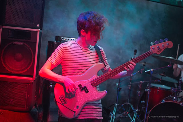
| My boy, playing in a Toronto club. Photo by the talented Haley Wheeler. Check out the band on their Facebook page, and their music on Bandcamp. |
**********
I won't have a regular post next weekend... my mom is finally moving and I will be otherwise occupied. Have a good one, and I'll see you for the Boxed In opening on June 9th.

No comments:
Post a Comment